This chapter covers the classes used to build dialogs, and the various kinds of command objects that can be included in a dialog.
The classes and command objects covered in this chapter include:
A type describing attributes of various command objects.
These attributes are used when defining command items. They are used to modify default behavior. These attributes are bit values, and some can be combined with an OR operation. Note that not all attributes can be used with all commands.
Used with a C_Button to indicate that this button will be the default button. The user can activate the default button by pressing the Enter key as well as using the mouse. It will most often be associated with the OK button.
Sometimes you may find it useful to have a command object that is not displayed at first. By using the CA_Hidden attribute, the command object will not be displayed. The space it will require in the dialog or dialog pane will still be allocated, but the command will not be displayed. You can then unhide (or hide) the command using the SetValue method: SetValue(CmdID, TrueOrFalse, Hidden).
Command will have horizontal orientation. This attribute is used with Sliders and Progress Bars.
The object should be larger than usual. It can be used with Lists, Progress Bars, Sliders, Text Ins, and Value Boxes.
Used with a C_Label to indicate that its string will be replaced with the message supplied to the ShowDialog method.
Used for frames and status bar labels, CA_NoBorder specifies that the object is to be displayed with no border.
Used for progress bars to suppress display of the value label.
Used for combo boxes and lists. When specified, the program will not be notified for each selection of a combo box item or a list item. When specified, the program is notified only when the combo box button is pressed, and must then use GetValue to retrieve the item selected in the combo box list. For lists, you will need another command button in the dialog to indicate list selection is done.
Used for frames, this attribute causes the command objects within the frame to be spaced together as tightly as possible. Normally, command objects have a space of several pixels between them when laid out in a dialog. The CA_NoSpace attribute is especially useful for producing a tightly spaced set of command buttons.
No special attributes. Used as a symbolic filler when defining items, and is really zero.
Used with progress bars to add a % to the value label.
The object should be smaller than usual. It can be used with Progress Bars and Text Ins. On Progress Bars, CA_Small means that the text value box will not be shown.
Used for Spinners to specify that a text list of possible values has been supplied.
Command will have vertical orientation. This attribute is used with Sliders and Progress Bars.
Used to define commands to dialogs and command panes.
This structure is used to define command items in dialogs and command panes. You will define a static array of CommandObject items. This array is then passed to the AddDialogCmds method of a dialog class such as vDialog or vModalDialog, or the constructor of a vCommandPane object, or more typically, a class derived from one of those.
typedef struct CommandObject
  {
    CmdType cmdType;    // what kind of item is this
    ItemVal cmdId;      // unique id for the item
    ItemVal retVal;     // initial value of object
    char* title;        // string
    void* itemList;     // used when cmd needs a list
    CmdAttribute attrs; // list of attributes
    int Sensitive;      // if item is sensitive or not
    ItemVal cFrame;     // Frame used for an item
    ItemVal cRightOf;   // Item placed left of this id
    ItemVal cBelow;     // Item placed below this one
    int size;           // Used for size information
  } CommandObject;
This value determines what kind of command item this is. The types of commands are explained in the section Commands.
This unique id for the command defined by the programmer. Each command item belonging to a dialog should have a unique id, and it is advisable to use some scheme to be sure the ids are unique. The V system does not do anything to check for duplicate ids, and the behavior is undefined for duplicate ids. The id for a command is passed to the DialogCommand method of the dialog, as well as being used for calls to the various SetX and GetX methods. There are many predefined values that can be used for ids as described in the chapter Standard V Values .
The values you use for your id in menus and controls should be limited to being less than 30,000. The predefined V values are all above 30,000, and are reserved. There is no enforcement of this policy. It is up to you to pick reasonable values.
The type ItemVal exists for historical reasons, and is equivalent to an int, and will remain so. Thus, the easiest way to assign and maintain unique ids for your controls is to use a C++ enum. As many as possible examples in this manual will use enums, but examples using the old style const codeItemVal declarations may continue to exist. There is more discussion of assigning ids in the following example.
The use of this value depends on the type of command. For buttons, for example, this value will be passed (along with the cmdId) to the DialogCommand method. The retVal is also used for the initial on/off state of check boxes and radio buttons. For some commands, retVal is unused. Note that the static storage provided in the declaration is not used to hold the value internally. You should use GetValue to retrieve the current value of a command object.
This is used for the label or text string used for command items.
This is used to pass values to commands that need lists or strings. The ListCmd is an example. Note the void * to allow arbitrary lists.
Some command items use attributes
to describe their behavior. These attributes are summarized
in Section  , CmdAttribute
.
, CmdAttribute
.
This is used to determine if an item is sensitive or not. Note that the static storage provided in the declaration is used by the V system to track the value, and should be changed by the SetValue method rather than directly. Thus dialogs sharing the same static declaration will all have the same value. This is usually desired behavior.
Command items may be placed within a frame. If this value is 0 (or better, the symbol NoFrame), the command will be placed in the main dialog area. If a value is supplied, then the command will be placed within the frame with the id cFrame.
These are used to describe the placement of a command within a dialog. Ids of other commands in the same dialog are used to determine placement. The current command will be placed to the right of the command cRightOf, and below the command cBelow. The commands left and above don't necessarily have to be adjacent. By careful use of these values, you can design very attractive dialogs. You can control the width of command objects by padding the label with blanks. Thus, for example, you can design a dialog with all buttons the same size.
You can also use the CA_Hidden attribute to selectively hide command objects that occupy the same location in the dialog. Thus, you might have a button labeled Hide right of and below the same command object as another button labeled UnHide. By giving one of the two buttons the CA_Hidden attribute, only one will be displayed. Then you can use SetValue at runtime to switch which button is displayed in the same location. The bigger of the two command objects will control the spacing.
The size parameter can be used for some command objects to specify size. For example, for labeled Button commands, the size specifies the minimum width in pixels of the button. It is also used in various other command objects as needed. A value of zero for size always means use the default size. Thus, you can take advantage of how C++ handles declarations and write CommandObject declarations that leave off the size values, which default to zero. Many of the examples in this reference do not specify these values.
The following example defines a simple dialog with a message label on the top row, a check box on the second row, two buttons in a horizontally organized frame on the third row, and an OK button on the bottom row. The ids in this example are defined using an enum. Remember that your ids must be less than 30,000, and using 0 is not a good idea. Thus, the enum in this example gives the ids values from 101 to 106. An alternative used in V code prior to release 1.13 was to provide const declarations to define meaningful symbolic values for the ids. Many examples of this type of id declaration will likely persist.
It also helps to use a consistent naming convention for ids. The quick reference appendix lists suggested prefixes for each control type under the CmdType section. For example, use an id of the form btnXXX for buttons. Predefined ids follow the form M_XXX.
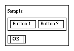
enum {lbl1 = 101, frm1, btn1, btn2,
static CommandObject Sample[] =
  {
    {C_Label, lbl1, 0,"Sample",NoList,CA_MainMsg,isSens,NoFrame,0,0},
    {C_Frame, frm1, 0, "", NoList,CA_None,isSens,NoFrame,0,lbl1},
    {C_Button, btn1, 0, "Button 1", NoList, CA_None, isSens,frm1,0,0},
    {C_Button, btn2, 0, "Button 2", NoList, CA_None, isSens,frm1,btn1,0},
    {C_Button, M_OK, M_OK, " OK ", NoList, CA_DefaultButton,
        isSens, NoFrame,0,frm1},
    {C_EndOfList,0,0,0,0,CA_None,0,0,0}
  };
vWindow, Predefined ItemVals, CmdAttribute, Commands
This section describes how each of the command objects available in V is used to build dialogs.
V provides several different kinds of command items that are used in dialogs. The kind of command is specified in the cmdType field of the CommandObject structure when defining a dialog. This section describes current dialog commands available with V . They will be constructed by V to conform to the conventions of the host windowing system. Each command is named by the value used to define it in the CommandObject structure.
A Blank can help you control the layout of your dialogs. The Blank object will occupy the space it would take if it were a C_Label, but nothing will be displayed. This is especially useful for leaving space between other command objects, and getting nice layouts with RightOfs and Belows. You control the size of the Blank by providing a string with an appropriate number of blanks for the title field.
This command object is just like a C_Label, but drawn with a surrounding box. See C_Label.

A Button is one of the primary command input items used in dialog boxes. When the user clicks on a Button, the values set in the cmdId and retVal fields are passed to the DialogCommand method. In practice, the retVal field is not really used for buttons -- the cmdId field is used in the switch statement of the DialogCommand method.
A button is defined in a CommandObject array. This is a typical definition:
{C_Button, btnId, 0,"Save",NoList,CA_None,isSens,NoFrame,0,0}
The retVal field can be used to hold any value you wish. For example, the predefined color button frame (see vColor) uses the cmdId field to identify each color button, and uses the retVal field to hold the index into the standard V color array. If you don't need to use the retVal, a safe convention is to a 0 for the retVal. You can put any label you wish in the title field.
If you provide the attribute CA_DefaultButton to the CmdAttribute field, then this button will be considered the default button for the dialog. The default button will be visually different than other buttons (usually a different border), and pressing the Return key is the same as clicking on the button.
You can change the label of a button with: SetString(btnId, "New Label"). You can change the sensitivity of a button with SetValue(btnID, OnOrOff, Sensitive).

A CheckBox is usually used to set some option on or off. A CheckBox command item consists of a check box and an associated label. When the user clicks on the check box, the DialogCommand method is invoked with the Id set to the cmdId and the Val set to the current state of the CheckBox. The system takes care of checking and unchecking the displayed check box -- the user code tracks the logical state of the check box.
A CheckBox is defined in a CommandObject array. This is a typical definition:
{C_CheckBox, chkId, 1,"Show Details",NoList,CA_None,isSens,NoFrame,0,0}
The retVal is used to indicate the initial state of the check box. You should use the GetValue method to get the current state of a check box. You can also track the state dynamically in the DialogCommand method. You can put any label you wish in the title field.
You can change the label of a check box with: SetString(chkId, "New Label"). You can change the sensitivity of a check box with SetValue(chkID, OnOrOff,Sensitive). You can change the checked state with SetValue(chkID, OnOrOff, Checked).
If the user clicks the Cancel button and your code calls the default DialogCommand method, V will automatically reset any check boxes back to their original state, and call the DialogCommand method an additional time with the original value if the state has changed. Thus, your code can track the state of check boxes as the user checks them, yet rely on the behavior of the Cancel button to reset changed check boxes to the original state.
The source code for the V vDebugDialog class provides a good example of using check boxes (at least for the X version). It is found in v/src/vdebug.cxx.

A color command button. This works exactly the same as a C_Button except that the button may be colored. You use C_ColorButton for the cmdType field, and provide a pointer to a vColor structure in the itemList field using a (void*) cast. The label is optional.
The
retVal field of a color button is not used. You can
generate a square color button of a specified size by specifying
an empty label ("") and a
size value greater
than 0. When you specify the
size field, the color button
will be a colored square
size pixels per side. When used
within a
CA_NoSpace frame, this feature would allow you
to build a palette of small, tightly spaced color buttons. In
fact, V
provides a couple of such palettes in
v/vcb2x4.h and
v/vcb2x8.h. These
include files, as well as the other details of the
vColor
class are described in the section
vColor in the Drawing
chapter.
There are two ways to change to color of a button. The most direct way is to change each of the RGB values in three successive calls to SetValue using Red, Green, and finally Blue as the ItemSetType to change the RGB values. The call with Blue causes the color to be updated. I know this isn't the most elegant way to do this, but it fits with the SetValue model.
An alternate way is to change the value of the original vColor used to define the initial color of the control, and then call SetValue with the ChangeColor set type.
This is a short example of defining a red button, and then changing it.
    static vColor btncolor(255,0,0};  // define red
    ...

    // part of a CommandObject definition
    {C_ColorButton, cbt1, 0, "", (void*)&btncolor,
        CA_None, isSens, NoFrame, 0, btnXXX},

    ...
    // Code to change the color by some arbitrary values
    btncolor.Set(btncolor.r()+127, btncolor.g()+63, btncolor.b()+31);
#ifdef ByColor    // by vColor after changing btncolor
    SetValue(cbt1,0,btncolor);
#else          // by individual colors
    SetValue(cbt1,(ItemVal)btncolor.r(),Red);
    SetValue(cbt1,(ItemVal)btncolor.g(),Green);
    // This final call with Blue causes color to update in dialog
    SetValue(cbt1,(ItemVal)btncolor.b(),Blue);
#endif
    ...
A combo box is a drop-down list. It normally appears as box with text accompanied by some kind of down arrow button. You pass a list of alternative text values in the itemList field of the CommandObject structure. You also must set the retVal field to the index (starting at 0) of the item in the list that is the default value for the combo box text title.
If the user clicks the arrow, a list pops up with a set of alternative text values for the combo box label. If the user picks one of the alternatives, the popup closes and the new value fills the text part of the combo box. V supports up to 32 items in the combo box list. You need to use a C_List if you need more than 32 items.
With default attributes, a combo box will send a message to DialogCommand whenever a user picks a selection from the combo box dialog. This can be useful for monitoring the item selected. If you define the combo box with the attribute CA_NoNotify, the dialog in not notified on each pick. You can use GetValue to retrieve the index of the item shown in the combo box text field.
You can preselect the value by using SetValue. You can change the contents of the combo list by using vDialog::SetValue with either ChangeList or ChangeListPtr. See vDialog::SetValue for more details.
The following is a simple example of using a combo box in a modal dialog. This example does not process items as they are clicked, and does not show code that would likely be in an overridden DialogCommand method. The code interface to a list and a combo box is very similar -- the interaction with the user is different. This example will initially fill the combo box label with the text of comboList[2].
enum { cbxId = 300 };
char* comboList[] =
  {
    "First 0",   // The first item in the list
     ...
    "Item N",    // The last item in the list
    0            // 0 terminates the list
  };
  ...
CommandObject ComboList[] =
  {
    {C_ComboBox, cbxId, 2, "A Combo Box", (void*)comboList,
       CA_NoNotify,isSens,NoFrame,0,0},
    {C_Button, M_OK, M_OK, " OK ", NoList,
       CA_DefaultButton, isSens, NoFrame, 0, ListId},
    {C_EndOfList,0,0,0,0,CA_None,0,0,0}
  };
    ...
    vModalDialog cd(this);    // create list dialog
    int cid, cval;
    ...
    cd.AddDialogCmds(comboList);   // Add commands to dialog
    cid = ld.ShowModalDialog("",cval);  // Wait for OK
    cval = ld.GetValue(cbxId);  // Retrieve the item selected
This is not really a command, but is used to denote end of the command list when defining a CommandObject structure.

The frame is a line around a related group of dialog command items. The dialog window itself can be considered to be the outermost frame. Just as the placement of commands within the dialog can be controlled with the cRightOf and cBelow fields, the placement of controls within the frame use the same fields. You then specify the id of the frame with the cFrame field, and then relative position within that frame.
The title field of a frame is not used.
You may supply the CA_NoBorder attribute to any frame, which will cause the frame to be drawn without a border. This can be used as a layout tool, and is especially useful to force buttons to line up in vertical columns.
See the section CommandObject for an example of defining a frame.
A display only icon. This works exactly the same as a C_Label except that an icon is displayed instead of text. You use C_Icon for the cmdType field, and provide a pointer to the vIcon object in the itemList field using a (void*) cast. You should also provide a meaningful label for the title field since some versions of V may not support icons.
You can't dynamically change the icon.

A command button Icon. This works exactly the same as a C_Button except that an icon is displayed for the button instead of text. You use C_IconButton for the cmdType field, and provide a pointer to the vIcon object in the itemList field using a (void*) cast. You should also provide a meaningful label for the title field since some versions of V may not support icons.
You can't dynamically change the icon. The button will be sized to fit the icon. Note that the v/icons directory contains quite a few icons suitable for using on command bars.
{C_Label, lblId,0,"Select Options",NoList,CA_None,isSens,NoFrame,0,0, 0,0}
While the value of a label can be changed with SetString(lblId, "New Label"), they are usually static items. If the label is defined with the CA_MainMsg attribute, then that label position will be used to fill the the message provided to the ShowDialog method.
A C_ColorLabel is a label that uses the List parameter of the CommandObject array to specify a vColor. You can specify the color and change the color in the same fashion as described in the C_ColorButton command.
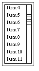
A list is a scrollable window of text items. The list can be made up of any number of items, but only a limited number are displayed in the list scroll box. Most implementations will show eight items at a time.
The user uses the scroll bar to show various parts of the list. Normally, when the user clicks on a list item, the DialogCommand is invoked with the id of the List command in the Id parameter, and the index into the list of the item selected in the Val parameter. This value may be less than zero, which means the user has unselected an item, and your code should properly handle this situation. This only means the user has selected the given item, but not that the selection is final. There usually must be a command Button such as OK to indicate final selection of the list item.
If the List is defined with the attribute CA_NoNotify, DialogCommand is not called with each pick. You must then use GetValue to get which item in the list was selected.
It is possible to preselect a given list item with the SetValue method. Use the GetValue to retrieve the selected item's index after the OK button is selected. A value less than zero means no item was selected.
Change the contents of the list with vDialog::SetValue using either ChangeList or ChangeListPtr. See vDialog::SetValue for more details.
The following is a simple example of using a list box in a modal dialog. This example does not process items as they are clicked.
enum {lstId = 200 };
char* testList[] =
  {
    "First 0",   // The first item in the list
     ...
    "Item N",    // The last item in the list
    0            // 0 terminates the list
  };
  ...
CommandObject ListList[] =
  {
    {C_List, lstId, 0, "A List", (void*)testList,
       CA_NoNotify,isSens,NoFrame,0,0},
    {C_Button, M_OK, M_OK, " OK ", NoList,
       CA_DefaultButton, isSens, NoFrame, 0, lstId},
    {C_EndOfList,0,0,0,0,CA_None,0,0,0}
  };
    ...
    vModalDialog ld(this);    // create list dialog
    int lid, lval;
    ...
    ld.AddDialogCmds(ListList);   // Add commands to dialog
    ld.SetValue(lstId,8,Value);  // pre-select 8th item
    lid = ld.ShowModalDialog("",lval);  // Wait for OK
    lval = ld.GetValue(lstId);  // Retrieve the item selected
Bar to show progress. Used with CA_Vertical or CA_Horizontal attributes to control orientation. You change the value of the progress bar with SetValue(ProgID, val, Value), where val is a value between 0 and 100, inclusive. Normally, the progress bar will show both a graphical indication of the value, and a text indication of the value between 0 and 100.
If you don't want the text value (for example, your value represents something other than 0 to 100), then define the progress bar with the CA_NoLabel attribute. Use the CA_Percent attribute to have a % added to the displayed value. You can also use CA_Small or CA_Large to make the progress bar smaller or larger than normal. If you need a text value display for ranges other than 0 to 100, you can build a CA_NoSpace frame with a progress bar and a text label that you modify yourself.
The following shows how to define a progress bar, and how to set its value.
enum{frm1 = 200, lbl1, pbrH, pbrV, ... };
  static CommandObject Cmds[] =
  {
    ...
    // Progress Bar in a frame
    {C_Frame, frm1, 0, "",NoList,CA_None,isSens,NoFrame, 0,0},
    {C_Label, lbl1, 0, "Progress",NoList,CA_None,isSens,frm1,0,0},
    {C_ProgressBar, pbrH, 50, "", NoList,
        CA_Horizontal,isSens,frm1, 0, lbl1},  // Horiz, with label

    {C_ProgressBar, pbrV, 50, "", NoList,  // Vertical, no value
      CA_Vertical | CA_Small, isSens,NoFrame, 0, frm1},
    ...
  };
  ...
  // Set the values of both bars to same
  SetValue(pbrH,retval,Value);    // The horizontal bar
  SetValue(pbrV,retval,Value);    // The vertical bar
Radio buttons are used to select one and only one item from a group. When the user clicks on one button of the group, the currently set button is turned off, and the new button is turned on. Note that for each radio button press, two events are generated. One a call to DialogCommand with the id of the button being turned off, and the other a call with the id of the button being turned on. The order of these two events is not guaranteed. The retVal field indicates the initial on or off state, and only one radio button in a group should be on.
Radio buttons are grouped by frame. You will typically put a group of radio buttons together in a frame. Any buttons not in a frame (in other words, those just in the dialog window) are grouped together.
Radio buttons are handled very much like check boxes. Your code should dynamically monitor the state of each radio button with the DialogCommand method. Selecting Cancel will automatically generate calls to DialogCommand to restore the each of the buttons to the original state.
You can use SetValue with a Value parameter to change the settings of the buttons at runtime. SetValue will enforce a single button on at a time.
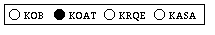
The following example of defining and using radio buttons was extracted from the sample file v/examp/mydialog.cpp. It starts with the button RB1 pushed.
enum {
    frmV1 = 200, rdb1, rdb2, rdb3, ...
...
  };
...
static CommandObject DefaultCmds[] =
  {
    {C_Frame, frmV1, 0,"Radios",NoList,CA_Vertical,isSens,NoFrame,0,0},
    {C_RadioButton, rdb1, 1, "KOB",  NoList,CA_None,isSens, fmV1,0,0},
    {C_RadioButton, rdb2, 0, "KOAT", NoList,CA_None, isSens,frmV1,0,0},
    {C_RadioButton, rdb3, 0, "KRQE", NoList,CA_None, isSens,frmV1,0,0},
    {C_Button, M_Cancel,M_Cancel,"Cancel",NoList,CA_None,
        isSens, NoFrame, 0, frmV1},
    {C_Button, M_OK, M_OK, " OK ", NoList, CA_DefaultButton,
        isSens, NoFrame, M_Cancel, frmV1},
    {C_EndOfList,0,0,0,0,CA_None,0,0,0}
  };
...
void myDialog::DialogCommand(ItemVal Id, ItemVal Val, CmdType Ctype)
  {
    switch (Id)              // switch on command id
      {
        case rdb1:            // Radio Button KOB
            // do something useful - current state is in retval
            break;
        ...
        // cases for other radio buttons

      }
    // let the super class handle M_Cancel and M_OK
    vDialog::DialogCommand(id,retval,ctype);
  }

Used to enter a value with a slider handle. The slider will provide your program with a value between 0 and 100, inclusive. Your program can then scale that value to whatever it needs.
V will draw sliders in one of three sizes. Use CA_Small for a small slider (which may not be big enough to return all values between 0 and 100 on all platforms), CA_Large to get a larger than normal slider, and no attribute to get a standard size slider that will return all values between 0 and 100. Use the CA_Vertical and CA_Horizontal attributes to specify orientation of the slider.
When the user changes the value of the slider, the DialogCommand method is called with the id of the slider for the Id value, and the current value of the slider for the Retval value. You can use SetVal to set a value for the slider.
The following example shows the definition line of a slider, and a code fragment from an overridden DialogCommand method to get the value of the dialog and update a C_Text item with the current value of the slider. The slider starts with a value of 50.
enum { frm1 = 80, sld1, txt1 };
CommandObject Commands[] =
  {
    ...
    {C_Frame, frm1, 0, "",NoList,CA_None,isSens,NoFrame,0,0},
    {C_Slider, sld1, 50, "",NoList,CA_Horizontal,isSens,frm1,0,0},
    {C_Text, txt1, 0, "", "50",CA_None,isSens, frm1, sld1, 0},
    ...
  };
  ...
void testDialog::DialogCommand(ItemVal id,
  ItemVal retval, CmdType ctype)
  {
    ...
    switch (id)     // Which dialog command item?
      {
        ...
        case sld1:    // The slider
          {
            char buff[20];
            sprintf(buff,"%d",retval);  // To string
            SetString(txt1,buff);      // Show value
          }
        ...
      }
    ...
  }
This command item is used to provide an easy way for the user to enter a value from a list of possible values, or in a range of values. Depending on the attributes supplied to the CommandObject definition, the user will be able to select from a short list of text values, from a range of integers, or starting with some initial integer value. As the user presses either the up or down arrow, the value changes to the next permissible value. The retVal field specifies the initial value of the integer, or the index of the initial item of the text list. You use the GetValue method to retrieve the final value from the C_Spinner.
You can change the contents of the spinner list by using vDialog::SetValue with either ChangeList or ChangeListPtr. See vDialog::SetValue for more details.
This example shows how to setup the C_Spinner to select a value from a text list (when supplied with a list and the CA_Text attribute), from a range of integers (when supplied a range list), or from a starting value (when no list is provided). The definitions of the rest of the dialog are not included.
  static char* spinList[] =    // a list of colors
    {
      "Red","Green","Blue", 0
    };
  static int minMaxStep[3] =  // specify range of
    {                         // -10 to 10
      -10, 10, 2              // in steps of 2
    };
  enum { spnColor = 300, spnMinMax, spnInt, ... };
  CommandObject SpinDialog[] =
    {
      ...
      {C_Spinner,spnColor,0,"Vbox", // A text list.
        (void*)spinList,CA_Text,     // the list is CA_Text
        isSens,NoFrame, 0,0},
      {C_Spinner,spnMinMax,0,"Vbox", // a range -10 to 10
        (void*)minMaxStep,CA_None,  // by 2's starting at 0
        isSens,NoFrame, 0,0},
      {C_Spinner,spnInt,32,"Vbox",  // int values step by 1
        NoList,CA_None,             // starting at 32
        isSens,NoFrame, 0,0},
      ...
    };
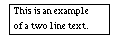
This draws boxed text. It is intended for displaying information
that might be changed, unlike a label, which is usually constant.
The text may be multi-line by using a
' n`. The
retVal and
title fields are not used. The text to
display is passed in the
itemList field.
n`. The
retVal and
title fields are not used. The text to
display is passed in the
itemList field.
You can use the CA_NoBorder attribute to suppress the border.
A definition of a C_Text item in a CommandObject definition would look like:
 {C_Text, txtId, 0, "", "This is an example\nof a two line text.",
          CA_None,isSens,NoFrame, 0, 0, 0,0},
You can change the label of text box with: SetString(txtId, "New text to show.").
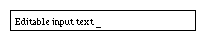
This command is used for text entry from the user. The text input command item will typically be boxed field that the user can use to enter text.
The strategy for using a TextIn command item is similar to the List command item. You need an OK button, and then retrieve the text after the dialog has been closed.
You can provide a default string in the title field which will be displayed in the TextIn field. The user will be able to edit the default string. Use an empty string to get a blank text entry field. The retVal field is not used.
There are two ways to control the size of the TextIn control. If you specify CA_None, you will get a TextIn useful form most simple input commands. Using CA_Large gets a wider TextIn, while CA_Small gets a smaller TextIn. You can also use the size field of the CommandObject to explicitly specify a width in characters. When you specify a size, that number of characters will fit in the TextIn, but the control does not enforce that size as a limit.
The following example demonstrates how to use a TextIn.
CommandObject textInList[] =
  {
    ...
    {C_TextIn, txiId,0,"",NoList,CA_None,isSens,NoFrame,0,0},
    ...
    {C_EndOfList,0,0,0,0,CA_None,0,0,0}
  };
 ...
    vModalDialog md(this);      /// make a dialog
    int ans, val;
    char text_buff[255];        // get text back to this buffer
 ...
    md.AddDialogCmds(textInList);  // add commands
    ans = md.ShowModalDialog("Enter text.", val);  // Show it
    text_buff[0] = 0;          // make an empty string
    (void) md.GetTextIn(txiId, text_buff, 254); // get the string
 ...
A C_ToggleButton is a combination of a button and a checkbox. When the toggle button is pressed, the vCmdWindow::WindowCommand method is called, just as with a regular command button. However, the system will change the look of the toggle button to indicate it has been pressed. Each click on a C_ToggleButton will cause the button to appear pressed in or pressed out.
The retVal field of the CommandObject definition is used to indicate the initial state of the toggle.
The behavior of a toggle button is like a check box, and not a radio button. This is more flexible, but if you need exclusive radio button like selection, you will have to enforce it yourself using SetValue(toggleId,val,Value).
 // Define a toggle button with id tbtToggle and
 // an initial state of 1, which means pressed in
 {C_ToggleButton,tbtToggle, 1,"", NoList,CA_None,
     isSens, NoFrame, 0, 0},
 ...

 // The case in WindowCommand should be like this:

    case tbtToggle:
      {
	// Always safest to retrieve current value
        ItemVal curval = GetValue(tbtToggle);
        // Now, do whatever you need to
        if (curval)
           ... it is pressed
        else
           ... it is not pressed
        break;
      }
A C_ToggleFrame is V 's answer to the Windows Tab control. While V doesn't have real Tab controls, using a combination of C_ToggleFrames and either radio buttons or toggle buttons, you can design very nice multi-frame dialogs.
A Toggle Frame works just like a regular C_Frame except that you can use SetValue with a type Value to hide or make visible all controls contained or nested in the toggle frame. (Note: setting the Value of a toggle frame is not the same as setting its Hidden attribute.)
The strategy for using toggle frames follows. First, you will usually use two or more toggle frames together. In the dialog CommandObject definition, you first define one radio button or one toggle button for each toggle frame used in the dialog. You then define a regular bordered C_Frame positioned below the radio/toggle buttons. Then place CA_NoBorder toggle frames inside that outer frame. The outer frame will be the border for all the toggle frames. Inside each toggle frame, you define controls in the normal way.
You must select just one of the toggle frames to be initially visible. This will correspond to the checked radio button or pressed toggle button. The remaining toggle frames and their controls should all be defined using the CA_Hidden attribute.
You then hide and unhide toggle frames by responding to the vDialog::DialogCommand messages generated when a radio button or toggle button is pressed. You SetValue(togID, 1, Value) to show a toggle pane and all its controls, and SetValue(togID, 0, Value) to hide all its controls.
The following example shows how to define and control toggle frames:
    enum {lbl1 = 400, tbt1, tbt2, tbt3, frm1, tfr1, tfr2,
          btnA1, btnB1, btnA2, btnB2 };
    static CommandObject DefaultCmds[] =
      {
        // A label, then 2 toggle buttons to select toggle frames
        {C_Label,lbl1,0,"Tab Frame Demo",NoList,CA_None,isSens,
                 NoFrame,0,0},
        {C_ToggleButton,tbt1,1,"Tab 1",NoList, CA_None, isSens,
                 lbl1, 0, 0},
        {C_ToggleButton,tbt2,0,"Tab 2",NoList, CA_None, isSens,
                 lbl1, tbt, 0},
        {C_ToggleButton,tbt3,0,"Tab 3",NoList, CA_None, isSens,
                 lbl1, tbt2 0},

        // A Master frame to give uniform border to toggle frames
        {C_Frame,frm1,0, "", NoList,CA_None,isSens,lbl1,0,tbt1},

        // Toggle Frame 1 - default frame on
        {C_ToggleFrame, tfr1,1,"",NoList, CA_NoBorder,isSens,frm1,0,0},
        {C_Button,btnA1,0,"Button A(1)",NoList,CA_None,isSens,tfr1,0,0},
        {C_Button,btnB1,0,"Button B(1)",NoList,CA_None,isSens,tfr1,
                  0,btnA1},

        // Toggle Frame 2 - default off (CA_Hidden!)
        {C_ToggleFrame,tfr2,0,"",NoList,CA_NoBorder | CA_Hidden,
                isSens,frm1,0,0},
        {C_Button,btnA2,0,"Button A(2)",NoList,CA_Hidden,isSens,tfr2,0,0},
        {C_Button,btnB2,0,"Button B(2)",NoList,CA_Hidden,isSens,tfr2,
                  btnA2,0},

        {C_EndOfList,0,0,0,0,CA_None,0,0,0}
      };


    ...

    // In the DialogCommand method:

    switch (id)         // We will do some things depending on value
      {
        case tbt1:       // For toggle buttons, assume toggle to ON
          {
            SetValue(id,1,Value);     // turn on toggle button
            SetValue(tbt2,0,Value);    // other one off
            SetValue(tfr2,0,Value);    // Toggle other frame off
            SetValue(tfr1,1,Value);    // and ours on
            break;
          }

        case tbt2:       // Toggle 2
          {
            SetValue(id,1,Value);     // turn on toggle button
            SetValue(tbt1,0,Value);    // other off
            SetValue(tfr1,0,Value);    // Toggle other off
	    SetValue(tfr2,1,Value);    // and ours on
            break;
          }

      }
    // All commands should also route through the parent handler
    vDialog::DialogCommand(id,retval,ctype);
  }
A C_ToggleIconButton is a combination of an icon button and a checkbox. When the toggle icon button is pressed, the vCmdWindow::WindowCommand method is called, just as with a regular icon button. However, the system will change the look of the toggle icon button to indicate it has been pressed. This is useful for good looking icon based interfaces to indicate to a user that some option has been selected. An additional press will change the appearance back to a normal icon button. The retVal field of the CommandObject definition is used to indicate the initial state of the toggle.
The behavior of a toggle icon button is like a check box, and not a radio button. This is more flexible, but if you need exclusive radio button like selection, you will have to enforce it yourself using SetValue(toggleId,val,Value).
 // Define a toggle icon button with id tibToggle and
 // an initial state of 1, which means pressed
 {C_ToggleIconButton,tibToggle, 1,"", &anIcon,CA_None,
     isSens, NoFrame, 0, 0},
 ...

 // The case in WindowCommand should be like this:

    case tibToggle:
      {
        // Always safest to retrieve current value
        ItemVal curval = GetValue(tibToggle);
        // Now, do whatever you need to
        if (curval)
           ... it is pressed
        else
           ... it is not pressed
        break;
      }
Used to define V icons.
Icons may be used for simple graphical labels in dialogs, as well as for graphical command buttons in dialogs and command bars. See the sections vButton and Dialog Commands for descriptions of using icons.
Presently, V
supports monochrome icons which allow an on or
off state for each pixel, and color icons of either 256 or  colors.
The format of V
monochrome icons is identical to the X bitmap format. This
is a packed array of unsigned characters (or bytes), with each bit
representing one pixel. The size of the icon is specified
separately from the icon array. The V
color icon format is internally
defined, and allows easy conversion to various color file formats
used by X and Windows.
colors.
The format of V
monochrome icons is identical to the X bitmap format. This
is a packed array of unsigned characters (or bytes), with each bit
representing one pixel. The size of the icon is specified
separately from the icon array. The V
color icon format is internally
defined, and allows easy conversion to various color file formats
used by X and Windows.
    class vIcon     // an icon
      {
      public:             //---------------------------------------- public
        vIcon(unsigned char* ic, int h, int w, int d = 1);
        ~vIcon();
        int height;             // height in pixels
        int width;              // width in pixels
        int depth;              // bits per pixel (1,8, or 24)
        unsigned char* icon;    // ptr to icon array

      protected:        //--------------------------------------- protected
      private:          //--------------------------------------- private
      };
The constructor for a vIcon has been designed to allow you to easily define an icon. The first parameter is a pointer to the static icon array. (Note: vIcon does not make a copy of the icon - it needs to be a static or persistent definition in your code.) The second and third parameters specify the height and width of the icon. The last parameter specifies depth.
This is the height in pixels of the icon.
This is the width in pixels of the icon. A icon will thus require (height * width) pixels. These bits are packed into bytes, with 0's padding the final byte if needed.
For monochrome icons, this will be one.
For color icons, the value is either 8 (for  or 256 colors) or 24
(for
or 256 colors) or 24
(for  colors).
This is a pointer to the array of bytes that contain the icon. V basically uses the format defined by X ( .XBM) bitmaps for monochrome bitmaps. It uses an internal format consisting of a color map followed by a one byte per pixel color icon description, or a three bytes per pixel color icon description.
The easiest way to define an icon is to include the definition of it in your code (either directly or by an #include). You then provide the address of the icon data plus its height and width to the initializer of the vIcon object.
The V distribution includes a simple icon editor that can be used to create and edit icons in standard .vbm format, as well as several other formats. You can also generate monochrome icons is with the X bitmap utility. That program allows you to draw a bitmap, and then save the definition as C code. This code can be included directly in your code and used in the initialization of the vIcon object. If you follow the example, you should be able to modify and play with your icons very easily.
A simple converter that converts a Windows .bmp format file to a V .vbm V bitmap format is also included in the standard V distribution. There are many utilities that let you generate .bmp files on both Windows and X, so this tool easily lets you add color icons of arbitrary size. Chapter 9 has more details on bmp2vbm.
The standard V distribution also contains a directory ( v/icons) with quite a few sample icons suitable for using in a command bar.
Once you have a .vbm file, the easiest way to add an icon to your program is to include code similar to this in your source:
#include "bruce.vbm"    // Picture of Bruce
  static vIcon bruceIcon(&bruce_bits[0], bruce_height,
                          bruce_width,8);
The following sections describe the format of the unsigned char* icon data for 1, 8, and 24 bit V icons.
Icon definitions are packed into bytes. A bit value of 1 represents Black, a 0 is White. The bytes are arranged by rows, starting with the top row, with the bytes padded with leading zeros to come out to whole bytes. The bytes are scanned in ascending order ( icon[0], icon[1], etc.). Within bytes, the bits are scanned from LSB to MSB. A 12 bit row with the pattern BBBWWBBWBWBW would be represented as unsigned char row[] = { 0x67, 0x05 };. This is the format produced by the X bitmap program.
Eight bit icons support 256 colors. Each pixel of the icon is
represented by one byte. Bytes are arranged in row order,
starting with the top row. Each byte represents an index into a
color map. The color map consists of RGB byte entries.
While an 8 bit icon can only have 256 colors, it can map into
 possible colors. Thus, each 8 bit icon must also include
the color map as part of its data.
The very first byte of the
icon data is the number of
entries in the color map minus one
possible colors. Thus, each 8 bit icon must also include
the color map as part of its data.
The very first byte of the
icon data is the number of
entries in the color map minus one (you don't have to define all 256
colors), followed by the color map RGB bytes, followed by the
icon pixels. The following is a very simple example of an icon:
(you don't have to define all 256
colors), followed by the color map RGB bytes, followed by the
icon pixels. The following is a very simple example of an icon:
//vbm8
#define color_width 16
#define color_height 12
#define color_depth 8
static unsigned char color_bits[] = {
       2,       // 3 colors in color map (2 == 3-1)
       255,0,0, // byte value 0 maps to red
       0,255,0, // 1 -> green
       0,0,255, // 2 -> blue
       // Now, the pixels: an rgb "flag", 3 16x4 rows
       0,0,0,0,0,0,0,0,0,0,0,0,0,0,0,0, // RRRRRRRRRRRRRRRR
       0,0,0,0,0,0,0,0,0,0,1,1,1,1,1,0, // RRRRRRRRRRBBBBBR
       0,0,0,0,0,0,0,0,0,0,1,1,1,1,1,0, // RRRRRRRRRRBBBBBR
       0,0,0,0,0,0,0,0,0,0,0,0,0,0,0,0, // RRRRRRRRRRRRRRRR
       1,1,1,1,1,1,1,1,1,1,1,1,1,1,1,1, // GGGGGGGGGGGGGGGG
       1,1,1,1,1,1,1,1,1,1,1,1,1,1,1,1, // GGGGGGGGGGGGGGGG
       1,1,1,1,1,1,1,1,1,1,1,1,1,1,1,1, // GGGGGGGGGGGGGGGG
       1,1,1,1,1,1,1,1,1,1,1,1,1,1,1,1, // GGGGGGGGGGGGGGGG
       2,2,2,2,2,2,2,2,2,2,2,2,2,2,2,2, // BBBBBBBBBBBBBBBB
       2,2,2,2,2,2,2,2,2,2,2,2,2,2,2,2, // BBBBBBBBBBBBBBBB
       2,2,2,2,2,2,2,2,2,2,2,2,2,2,2,2, // BBBBBBBBBBBBBBBB
       2,2,2,2,2,2,2,2,2,2,2,2,2,2,2,2  // BBBBBBBBBBBBBBBB
     };

static vIcon colorIcon(&color_bits[0], color_height, color_width,
     color_depth);
Twenty-four bit icons are arranged in rows, staring with the top row, of three bytes per pixel. Each 3 byte pixel value represents an RGB value. There is no color map, and the RGB pixel values start immediately in the unsigned char* icon data array. This is a simple example of a 24 bit icon.
//vbm24
#define c24_height 9
#define c24_width 6
#define c24_depth 24
    static unsigned char c24_bits[] = {
     255,0,0,255,0,0,255,0,0,255,0,0,0,255,0,0,255,0, //RRRRGG
     255,0,0,255,0,0,255,0,0,255,0,0,0,255,0,0,255,0, //RRRRGG
     255,0,0,255,0,0,255,0,0,255,0,0,255,0,0,255,0,0, //RRRRRR
     0,255,0,0,255,0,0,255,0,0,255,0,0,255,0,0,255,0, //GGGGGG
     0,255,0,0,255,0,0,255,0,0,255,0,0,255,0,0,255,0, //GGGGGG
     0,255,0,0,255,0,0,255,0,0,255,0,0,255,0,0,255,0, //GGGGGG
     0,0,255,0,0,255,0,0,255,0,0,255,0,0,255,0,0,255, //BBBBBB
     0,0,255,0,0,255,0,0,255,0,0,255,0,0,255,0,0,255, //BBBBBB
     0,0,255,0,0,255,0,0,255,0,0,255,0,0,255,0,0,255  //BBBBBB
    };
    static vIcon c24Icon(&c24_bits[0], c24_height, c24_width,
        c24_depth);
This example uses the definition of the checked box used by the Athena checkbox dialog command.
// This code is generated by the V Icon Editor:
//vbm1
#define checkbox_width 12
#define checkbox_height 12
#define checkbox_depth 1
static unsigned char checkbox_bits[] = {
   0xff, 0x0f, 0x03, 0x0c, 0x05, 0x0a, 0x09, 0x09,
   0x91, 0x08, 0x61,  0x08, 0x61, 0x08, 0x91, 0x08,
   0x09, 0x09, 0x05, 0x0a, 0x03, 0x0c, 0xff, 0x0f};

// This code uses the above definitions to define an icon
// in the initializer of checkIcon to vIcon.

static vIcon checkIcon(&checkbox_bits[0],
    checkbox_height, checkbox_width, checkbox_depth);
vButton, Dialog Commands C_Icon and C_IconButton
Class to build a modeless dialog.
The vDialog class is used to build modeless dialogs. Since most dialogs will require a response to the commands they define, you will almost always derive your own subclass based on vDialog, and override the DialogCommand method to handle those commands. Note that vDialog is multiply derived from the vBaseWindow and the vCmdParent classes.
A dialog is constructed by calling it with a pointer to a vBaseWindow or vApp, which is usually the 'this' of the object that creates the vDialog. The isModal parameter indicates if the dialog should be modal or modeless. You would usually use the default of 0. The modal flag is used by the derived vModalDialog class. The title parameter can be used to set a title for your dialog (see SetDialogTitle for information on titles). If you create a derived dialog class, you might provide a parent and a title in your constructor, and provide the 0 for the isModal flag in the call to the vDialog constructor.
The constructor builds an empty dialog. The AddDialogCmds method must be called in order to build a useful dialog, which you would usually do from within the constructor of your derived dialog class.
IMPORTANT! When you derive your own vDialog objects, you should write constructors for both the vBaseWindow* and vApp* versions. These two different constructors allow dialogs to be used both from windows directly, and from the vApp code as well. Normally, you would construct a dialog from a window. Occasionally, it will be useful to build a dialog from the vApp that applies to all windows, and not just the window that constructed it.
This method is used to add a list of commands to a dialog. It is called after the dialog object has been created. You can usually do this in the constructor for your derived Dialog class. This method is passed an array of CommandObject structures.
This can be used to dynamically change the title of any object derived from a vDialog object. Note that the title will not always be displayed. This depends on the host system. For example, the user can set up their X window manager to not show decorations on transient windows, which is how dialogs are implemented on X. You should write your applications to provide a meaningful title as they are often helpful when displayed.
This example shows the steps required to use a dialog object. Note that the example uses the vDialog class directly, and thus only uses the default behavior of responding to the OK button.
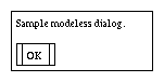
#include <v/vdialog.h>
    CommandObject cmdList[] =           // list of the commands
      {
        {C_Label, lbl1, 0, "Label",NoList,CA_MainMsg,isSens,0,0},
        {C_Button, M_OK, M_OK, " OK ", NoList,
            CA_DefaultButton, isSens,lbl1,0},
        {C_EndOfList,0,0,0,0,CA_None,0,0}  // This ends list
      };
    ...
    vDialog curDialog(this,0,"Sample Dialog"); // create dialog instance

    curDialog.AddDialogCmds(cmdList);          // add the commands

    curDialog.ShowDialog("Sample modeless dialog."); // invoke
    ...
This example creates a simple modeless dialog with a label and an OK button placed below the label (see the description of layout control below). ShowDialog displays the dialog, and the vDialog::DialogCommand method will be invoked with the id (2) and value ( M_OK) of the OK button when it is pressed.
Use the vModalDialog class to define modal dialogs.
The CommandObject structure includes the following:
    typedef struct CommandObject
      {
        CmdType cmdType;    // what kind of item is this
        ItemVal cmdId;      // unique id for the item
        ItemVal retVal;     // initial value
                            //  depends on type of command
        char* title;        // string for label or title
        void* itemList;     // a list of stuff to use for the cmd
                            //  depends on type of command
        CmdAttribute attrs; // list of attributes of command
        unsigned
             Sensitive:1;   // if item is sensitive or not
        ItemVal cFrame;     // if item part of a frame
        ItemVal cRightOf;   // Item placed left of this id
        ItemVal cBelow;     // Item placed below this one
        int size;           // Used for size information
      } CommandObject;
Placements of command objects within the dialog box are controlled by the cRightOf and cBelow fields. By specifying where an object goes in relation to other command objects in the dialog, it is simple to get a very pleasing layout of the dialog. The exact spacing of command objects is controlled by the vDialog class, but the application can used C_Blank command objects to help control spacing.
The various types of command objects that can be added include (with suggested id prefix in parens):
    C_EndOfList:   Used to denote end of command list
    C_Blank:       filler to help RightOfs, Belows work (blk)
    C_BoxedLabel:  a label with a box (bxl)
    C_Button:      Button (btn)
    C_CheckBox:    Checked Item (chk)
    C_ColorButton: Colored button (cbt)
    C_ColorLabel:  Colored label (clb)
    C_ComboBox:    Popup combo list (cbx)
    C_Frame:       General purpose frame (frm)
    C_Icon:        a display only Icon (ico)
    C_IconButton:  a command button Icon (icb)
    C_Label:       Regular text label (lbl)
    C_List:        List of items (lst)
    C_ProgressBar: Bar to show progress (pbr)
    C_RadioButton: Radio button (rdb)
    C_Slider:      Slider to enter value (sld)
    C_Spinner:     Spinner value entry (spn)
    C_TextIn:      Text input field (txi)
    C_Text:        wrapping text out (txt)
    C_ToggleButton: a toggle button (tbt)
    C_ToggleFrame: a toggle frame (tfr)
    C_ToggleIconButton:  a toggle Icon button (tib)
The use of these commands is described in the DialogCommand section.
This method is used to cancel any action that took place in the dialog. The values of any items in the dialog are reset to their original values, and the This method is automatically invoked when the user selects a button with the value M_Cancel and the DialogCommand method invoked as appropriate to reset values of check boxes and so on. CancelDialog can also be invoked by the application code.
The CloseDialog is used to close the dialog. It can be called by user code, and is automatically invoked if the user selects the M_Done or M_OK buttons and the the user either doesn't override the DialogCommand or calls the default DialogCommand from any derived DialogCommand methods.
This method is invoked when a user selects some command item of the dialog. The default DialogCommand method will normally be overridden by a user derived class. It is useful to call the default DialogCommand from the derived method for default handling of the M_Cancel and M_OK buttons.
The Id parameter is the value of the cmdId field of the CommandObject structure. The Val parameter is the retVal value, and the Type is the cmdType.
The user defined DialogCommand is where most of the work defined by the dialog is done. Typically the derived DialogCommand will have a switch statement with a case for each of the command cmdId values defined for items in the dialog.
This method is called by the V runtime system after a dialog has actually been displayed on the screen. This method is especially useful to override to set values of dialog controls with SetValue and SetString.
It is important to understand that the dialog does not get displayed until ShowDialog or ShowModalDialog has been called. There is a very important practical limitation implied by this, especially for modal dialogs. The values of controls cannot be changed until the dialog has been displayed, even though the vDialog object may exist. Thus, you can't call SetValue or SetString until after you call ShowDialog for modeless dialogs, or ShowModalDialog for modal dialogs. Since ShowModalDialog does not return until the user has closed the dialog, you must override DialogDisplayed if you want to change the values of controls in a modal dialog dynamically.
For most applications, this is not a problem because the static definitions of controls in the CommandObject definition will be usually be what is needed. However, if you need to create a dialog that has those values changed at runtime, then the easiest way is to include the required SetValue and SetString calls inside the overridden DialogDisplayed.
Returns the position and size of this dialog. These values reflect the actual position and size on the screen of the dialog. The intent of this method is to allow you to find out where a dialog is so position it so that it doesn't cover a window.
This method is called by the application to retrieve any text entered into any C_TextIn items included in the dialog box. It will usually be called after the dialog is closed. You call GetTextIn with the Id of the TextIn command, the address of a buffer ( str), and the size of str in maxlen.
This method is called by the user code to retrieve values of command items, usually after the dialog is closed. The most typical use is to get the index of any item selected by the user in a C_List or C_ComboBox.
This returns true if the dialog object is currently displayed, and false if it isn't. Typically, it will make sense only to have a single displayed instance of any dialog, and your code will want to create only one instance of any dialog. Since modal dialogs allow the user to continue to interact with the parent window, you must prevent multiple calls to ShowDialog. One way would be to make the command that displays the dialog to be insensitive. IsDisplayed() is provided as an alternative method. You can check the IsDisplayed() status before calling ShowDialog.
Moves this dialog to the location left and top. This function can be used to move dialogs so they don't cover other windows.
This method is used to change the state of dialog command items. The ItemSetType parameter is used to control what is set. Not all dialog command items can use all types of settings. The possibilities include:
The Checked type is used to change the checked status of check boxes. V will normally handle checkboxes, but if you implement a command such as Check All, you can use SetValue to change the check state according to ItemVal val.
The Sensitive type is used to change the sensitivity of a dialog command.
The Value type is used primarily to preselect the item specified by ItemVal val in a list or combo box list.
Lists, Combo Boxes, and Spinners use the itemList field of the defining CommandObject to specify an appropriate list. SetValue provides two ways to change the list values associated with these controls.
The key to using ChangeListPtr and ChangeList is an understanding of just how the controls use the list. When a list type control is instantiated, it keeps a private copy of the pointer to the original list as specified in the itemList field of the defining CommandObject.
So if you want to change the original list, then ChangeList is used. The original list may be longer or shorter, but it must be in the same place. Remember that a NULL entry marks the end of the list. So you could allocate a 100 item array, for example, and then reuse it to hold 0 to 100 items.
Call SetValue with type set to ChangeList. This will cause the list to be updated. Note that you must not change the itemList pointer used when you defined the list or combo box. The contents of the list can change, but the pointer must be the same. The val parameter is not used for ChangeList.
Sometimes, especially for regular list controls, a statically sized list just won't work. Using ChangeListPtr allows you to use dynamically created list, but with a small coding penalty. To use ChangeListPtr, you must first modify the contents of the itemList field of the original CommandObject definition to point the the new list. Then call SetValue with ChangeListPtr. Note that this will both update the pointer, and update the contents of the list. You don't need to call again with ChangeList.
The following illustrates using both types of list change:
  char* comboList[] = {
    "Bruce", "Katrina", "Risa", "Van", 0 };
  char* list1[] = {"1", "2", "3", 0};
  char* list2[] = {"A", "B", "C", "D", 0};

  // The definition of the dialog
  CommandObject ListExample[] = {
    {C_ComboBox,100,0,"",(void*)comboList,CA_None,isSens,0,0,0},
    {C_List,200,0,"",(void*)list1,CA_None,isSens,0,0,0},
    ...
    };
   ...

    // Change the contents of the combo list
    comboList[0] = "Wampler";  // Change Bruce to Wampler
    SetValue(200,0,ChangeList);
   ...
    // Change to a new list entirely for list
    // Note that we have to change ListExample[1], the
    // original definition of the list control.
    ListExample[1].itemList = (void*)list2;  // change to list2
    SetValue(100,0,ChangeListPtr);
   ...
Note that this example uses static definitions of lists. It is perfectly fine to use completely dynamic lists: you just have to dynamically fill in the appropriate itemList field of the defining CommandObject.
Please see the description of DialogDisplayed for an important discussion of setting dialog control values.
This method is called to set the string values of dialog items. This can include the labels on check boxes and radio buttons and labels, as well as the text value of a Text item.
Please see the description of DialogDisplayed for an important discussion of setting dialog control values.
After the dialog has been defined, it must then be displayed by calling the ShowDialog method. If a C_Label was defined with a CA_MainMsg attribute, then the message provided to ShowDialog will be used for that label.
ShowDialog returns to the calling code as soon as the dialog is displayed. It is up to the DialogCommand method to then handle command input to the dialog, and to close the dialog when done.
Please see the description of DialogDisplayed for an important discussion of setting dialog control values.
None.
None.
vModalDialog
Used to show modal dialogs.
This class is an implementation of a modal dialog. This means that the dialog grabs control, and waits for the user to select an appropriate command from the dialog. You can use any of the methods defined by the vDialog class, as well as the new ShowModalDialog method.
There are two versions of the constructor, one for constructing dialogs from windows, the other from the vApp object. See the description of the vDialog constructor for more details.
The default value for the title is an empty string, so you can declare instances of modal dialogs without the title string if you wish. The dialog title will always show in Windows, but in X is dependent on how the window manager treats decorations on transient windows.
This method displays the dialog, and does not return until the modal dialog is closed. It returns the id of the button that caused the return, and in retval, the value of the button causing the return as defined in the dialog declaration.
Please see the description of DialogDisplayed for an important discussion of setting dialog control values.
There are a couple of ways to close a modal dialog and make ShowModalDialog return, all controlled by the DialogCommand method. The default DialogCommand will close the modal dialog automatically when the user clicks the M_Cancel, M_Done, or M_OK buttons.
All command actions are still passed to the virtual DialogCommand method, which is usually overridden in the derived class. By first calling vModalDialog::DialogCommand to handle the default operation, and then checking for the other buttons that should close the dialog, you can also close the dialog by calling the CloseDialog method, which will cause the return.
The following code demonstrates this.
    void myModal::DialogCommand(ItemVal id, ItemVal val,
        CmdType ctype)
      {
        // Call the parent for default processing
        vModalDialog::DialogCommand(id,val,ctype);
        if (id == M_Yes || id == M_No) // These close, too.
            CloseDialog();
      }
Adds a little functionality for handling this modally.
vDialog